As those of you who have had a chance to play with Adobe’s recent foray in generative AI may know, Firefly is organized into modules. Those modules currently number three, with more on the way. The most recent is Recolor Vectors.
On the face of it, Recolor Vectors may sound something less than glamorous. Its job is to take a piece of vector-based artwork, assess the quantity of unique colors, and swap them out for new colors—without consolidation. In other words, previously unique colors remain unique.
How is this preferable to the Recolor Artwork feature built into Illustrator? And where does the generative AI come in?
Illustrator’s Recolor Artwork is arguably more powerful. It allows you to consolidate colors, link color harmonies, specify color values, drag colors inside a hue wheel, and so on. In contrast, Firefly is a little like rolling a rainbow-colored die and hoping you like the results.
The gateway to the generative AI is the text prompt: As opposed to entering color values, you can enter color names, evoke a mood, describe a look and feel. In other words, you can have fun. (Yes, AI will hunt you down and steal your soul, but it is undeniably fun.)
To learn all about it, watch my YouTube video, in which I take you on a guided tour of Recolor Vectors, including the Harmony options. (To see those options at work, check out color.adobe.com.) But for now, let me present you with an approach I tried over the weekend that I found truly enjoyable—even freeing.
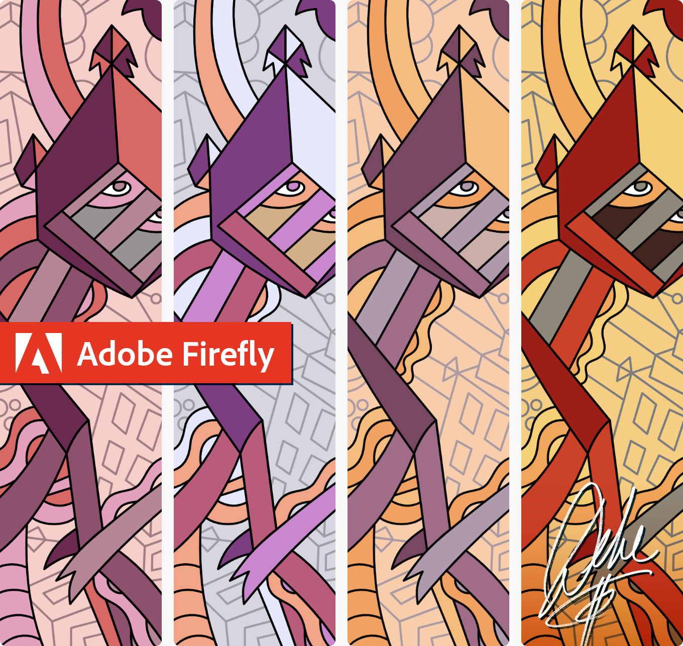
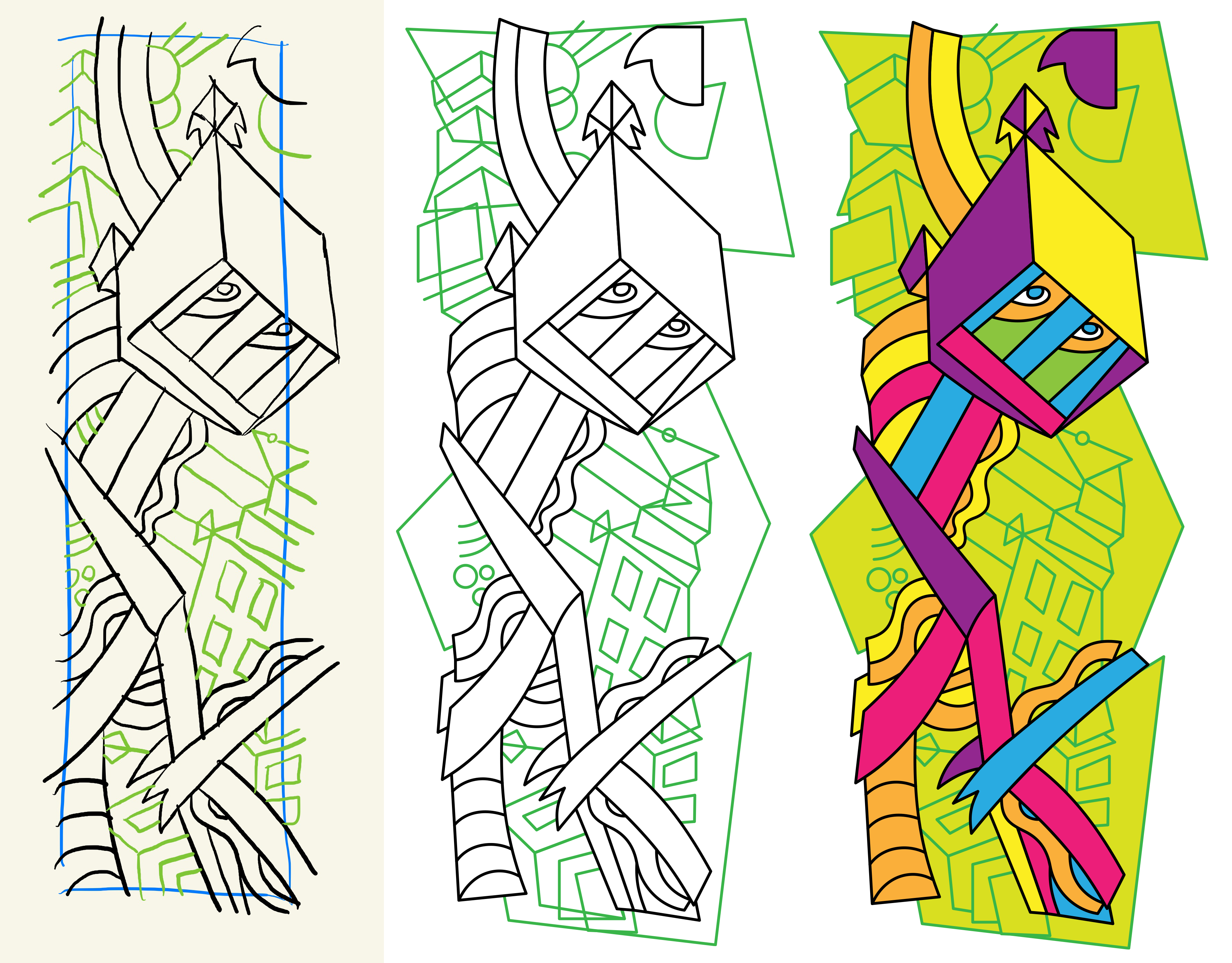
I started by sketching an idea on my iPad in Goodnotes. (Below left.) Then I brought that sketch into Illustrator and traced it with the Pen tool (middle). Finally, I assigned a few arbitrary swatches included when you create a new Art & Illustration document (right). Nine colors in all, if you include black and white.
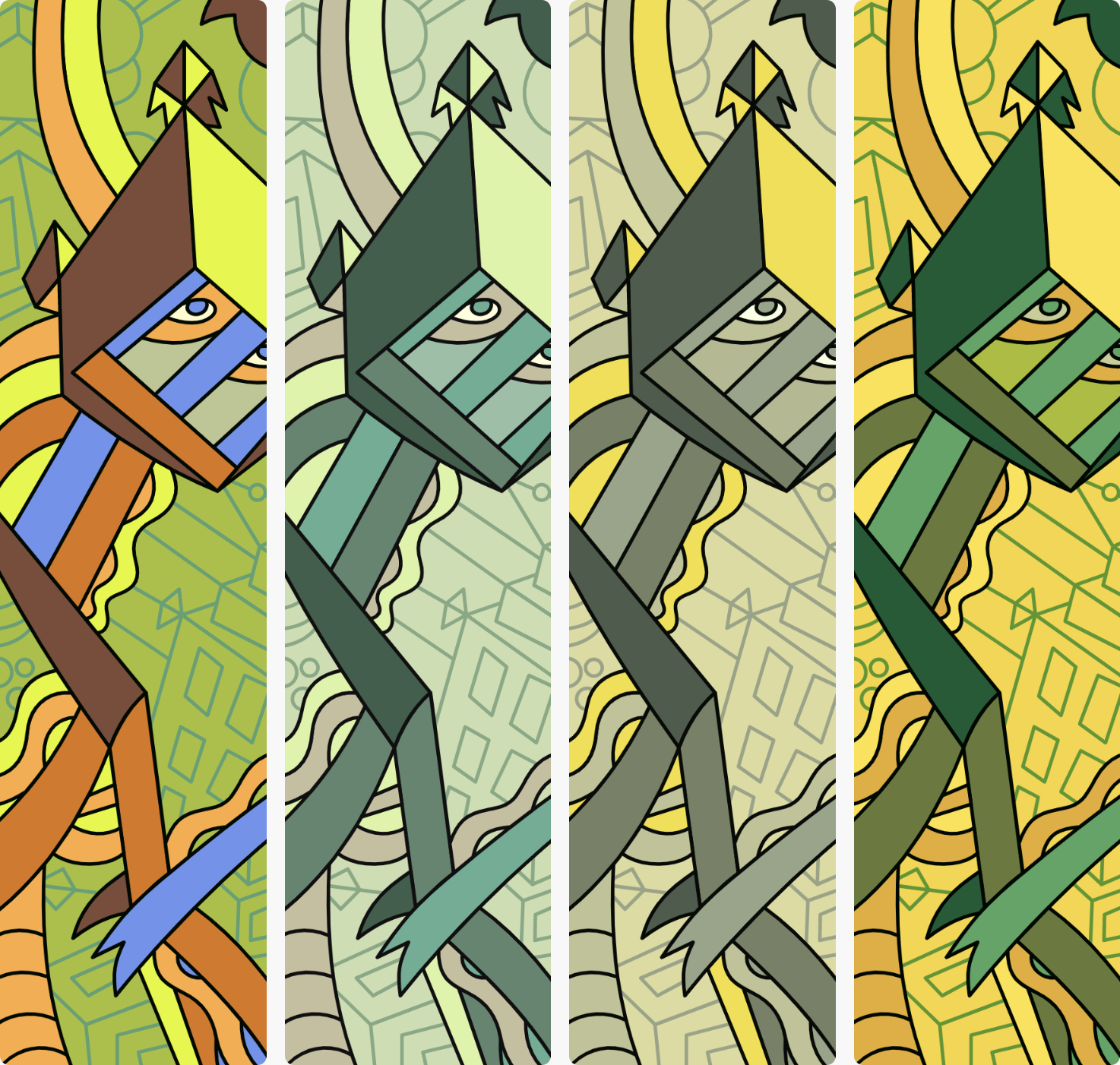
I’ll be honest: I like drawing. I love to draw. Few things take me allow me to escape the four walls of today like drawing. But I sometimes find assigning colors to be a dull chore. I’m a line art fan. So for me, assigning a bunch of arbitrary swatches and recoloring with a text prompt in Firefly is bliss. Four results at a time. Below, my prompt was “muted greens and spring flowers.” If you don’t like those, click Refresh. And again. And again.
SVG file in, SVG file out, round-trip it with Illustrator or whatever app you like, as I explore in detail at my Patreon.
Is Recolor Vectors scientific? Not oppressively so. Is it flexible? Yes, it is. And you ask me, it’s a whole lot of fun.


