Greetings, my dekelySpecials. Sorry for the delay in this week’s Deke’s Techniques write-up, we’ve been chasing the eclipse in Alliance, Nebraska: home of Carhenge, ecliptic-al totality, and our amazing hosts at the Furman Bunkhouse (waves at Tom and Stephanie). More on our eclipse experience coming up shortly.
In this week’s free episode, Deke shows you how to kern letters in Illustrator for a perfectly crafted, slanted, letters-get-along-in-peace-and-harmony logo:
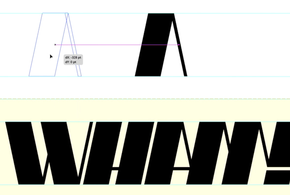
You don’t have to have ever cared about kerning (adjusting the space between letters in typographic layout) before to see the value here. And there’s value (to my Illustrator-ignorant mind) to just learning how to move the letters around properly.
For members of Lynda.com, Deke’s got an exclusive movie this week in which he shows you how he made the A and the M not only properly kerned friends, but virtual intimates by overlapping the letters.
Deke’s Techniques, where our letters, at the very least, live in peace and harmony!


Be the first to drop some wisdom...